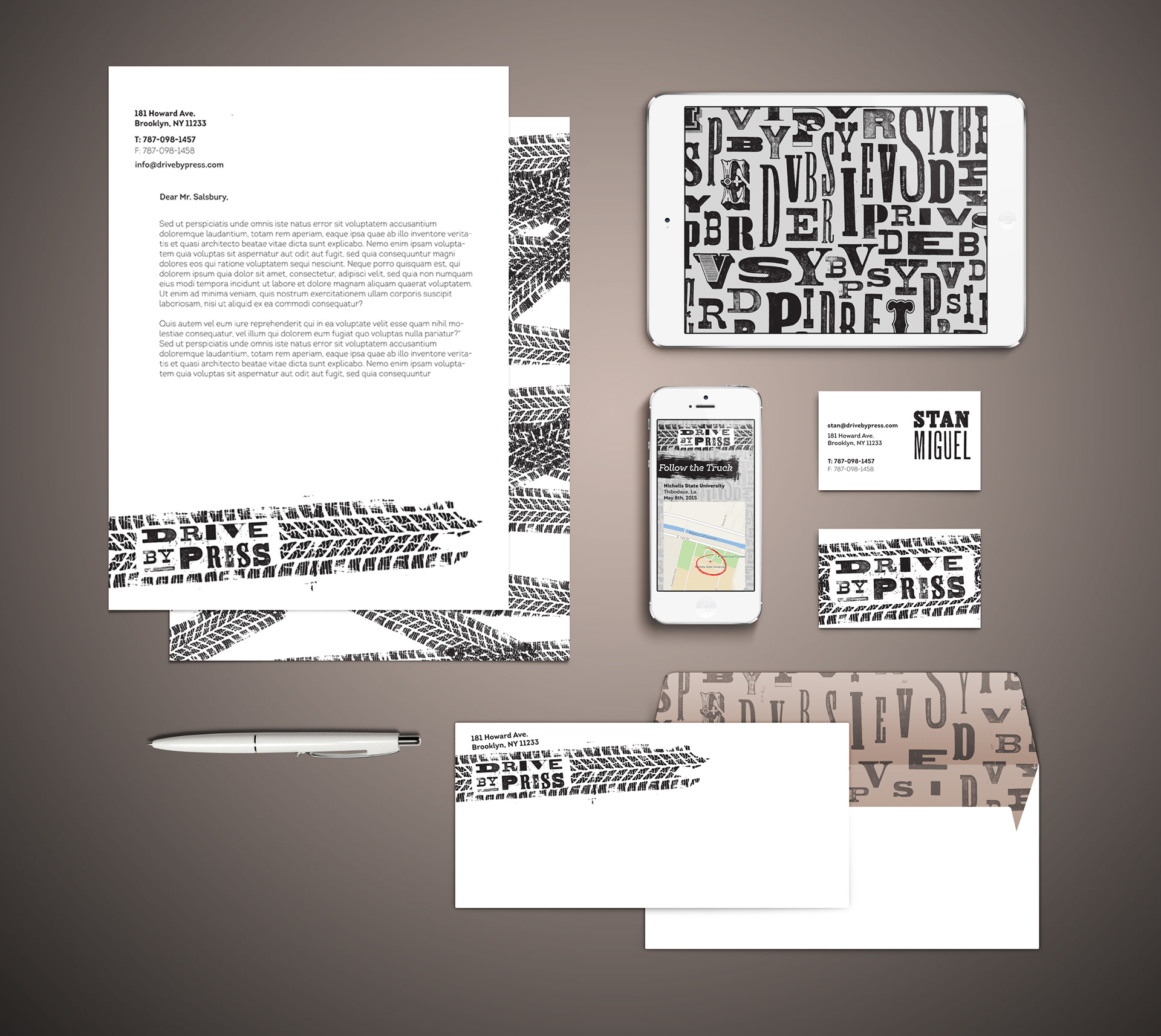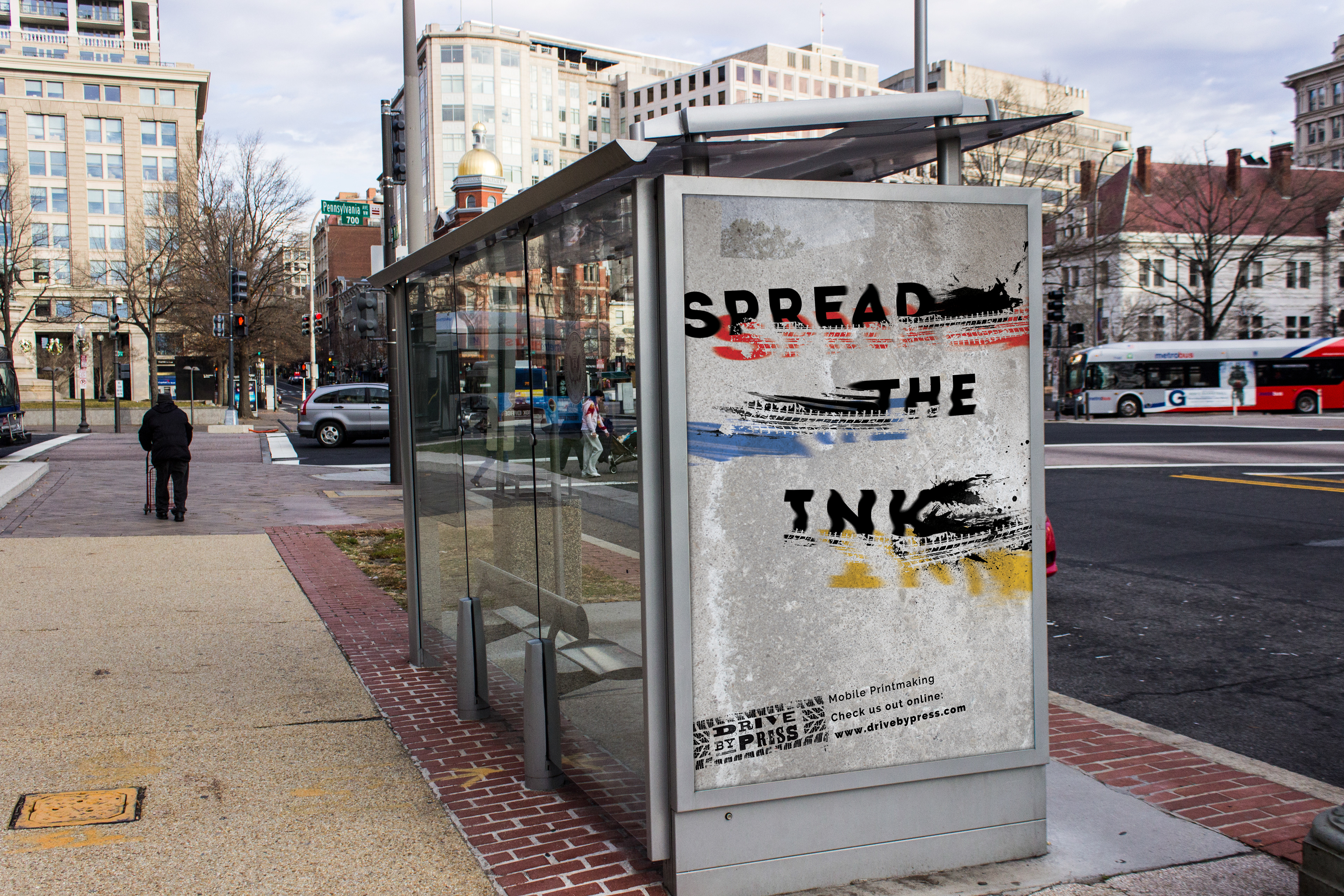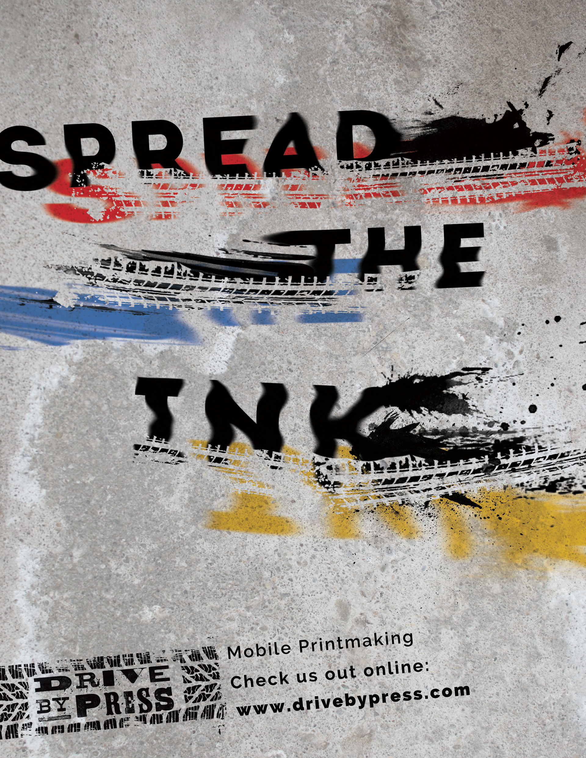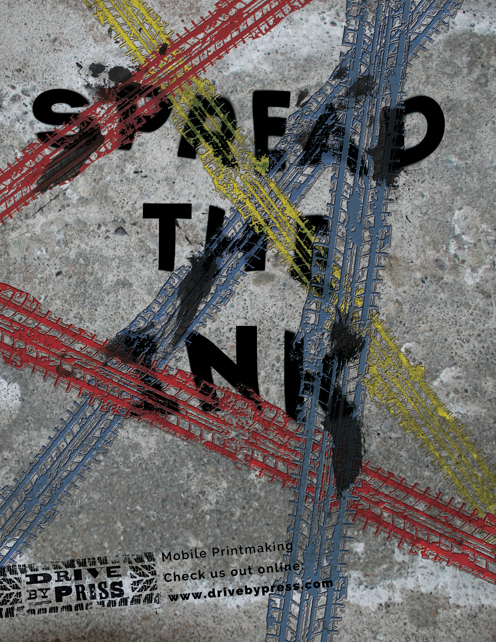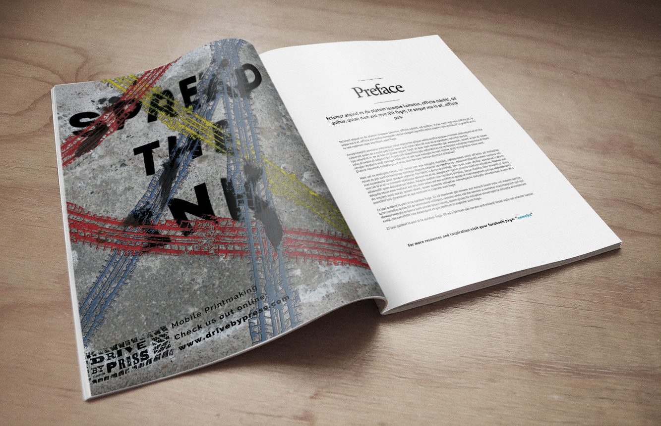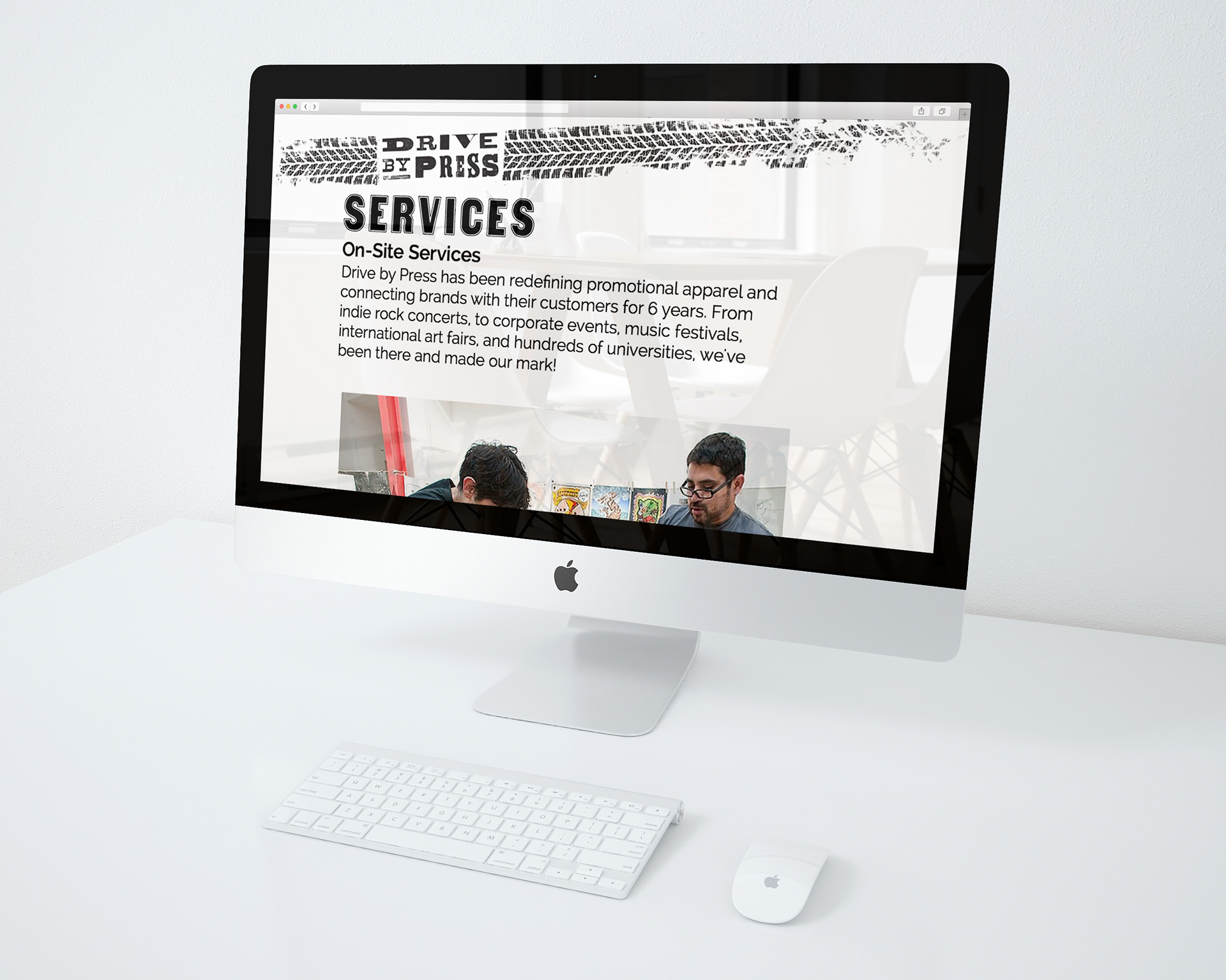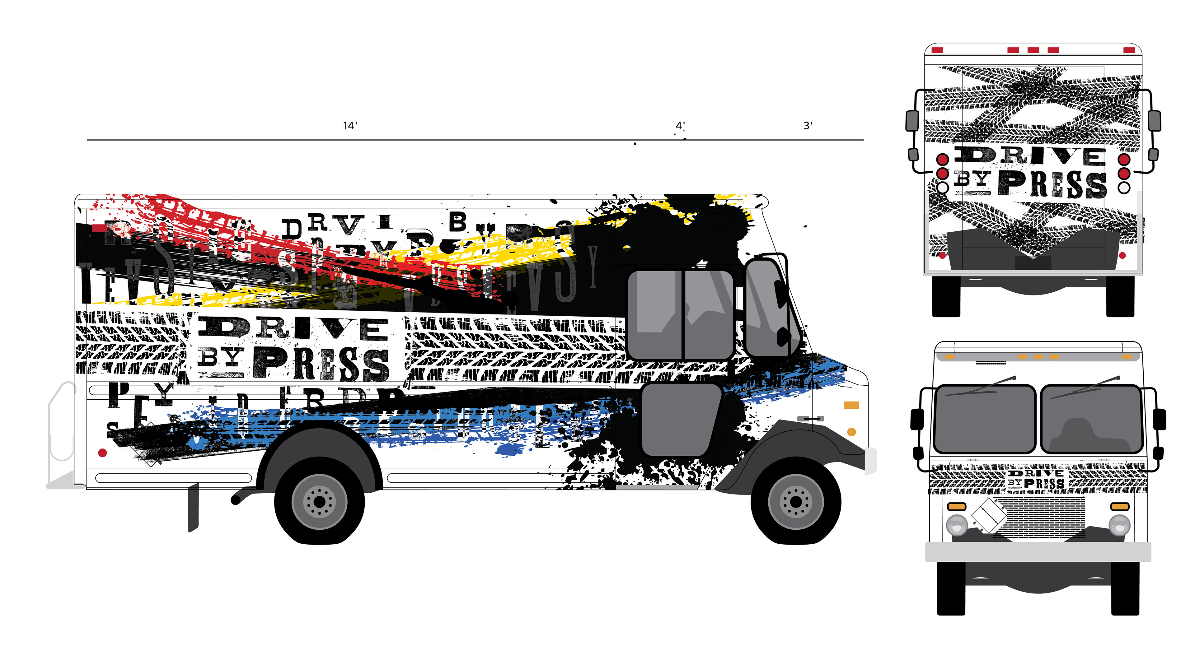
This is a rebrand of Drive By Press made for my senior project.
Drive By Press is a group of designers and artists, who take a 600 year old printing
process, merge it with their own contemporary imagery, and travel around the world to
bring an exciting and interactive form of entertainment.
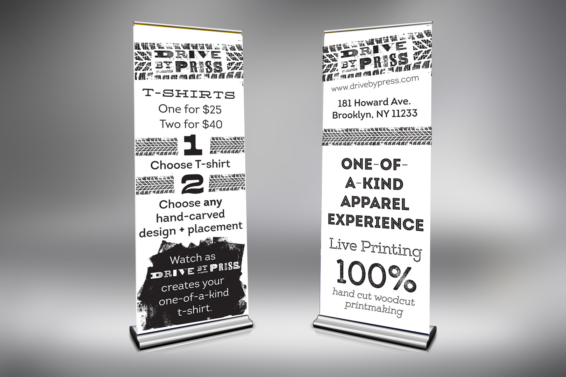
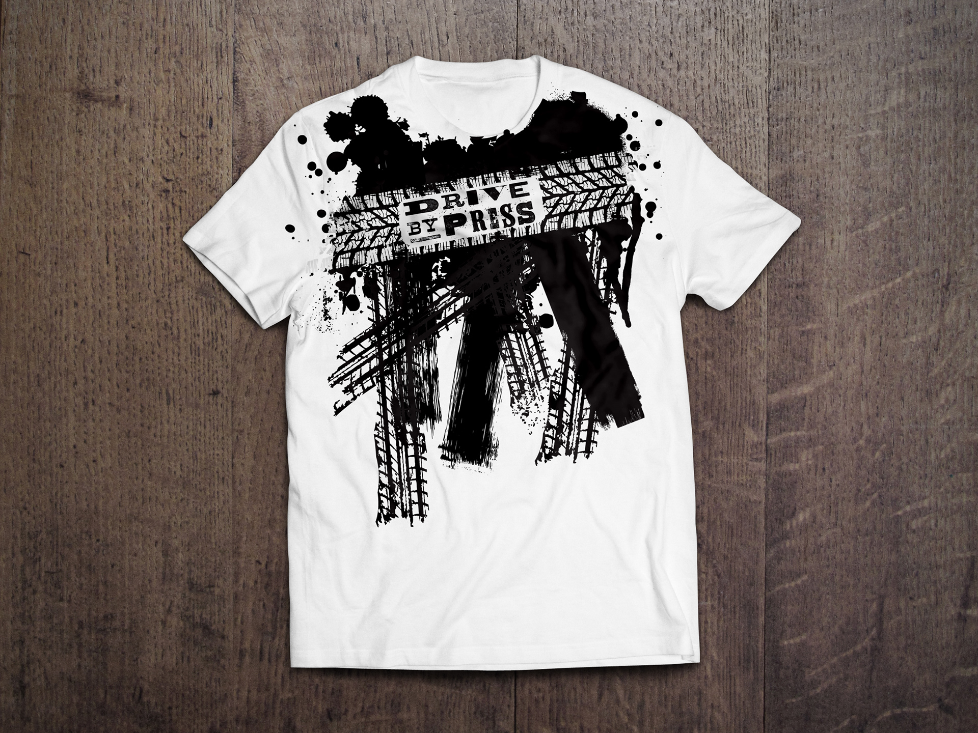
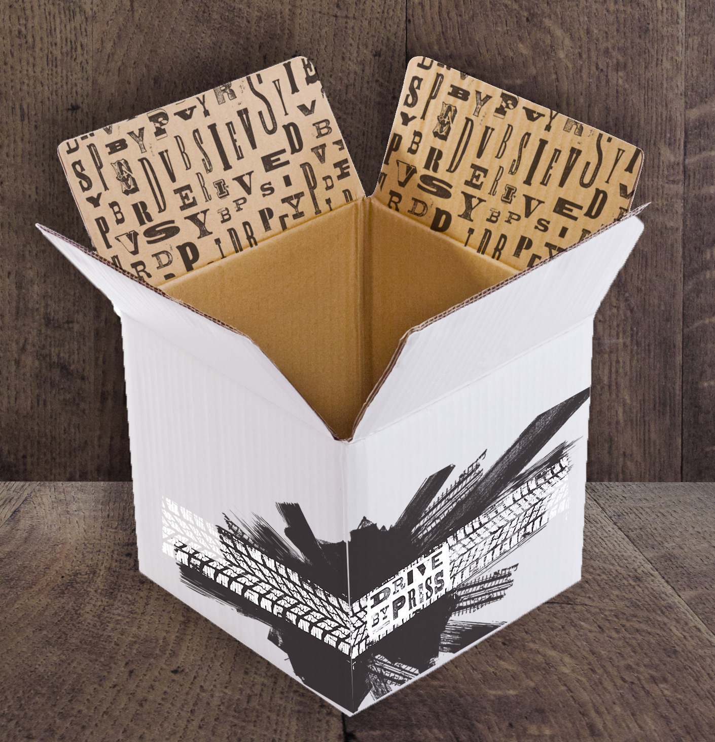
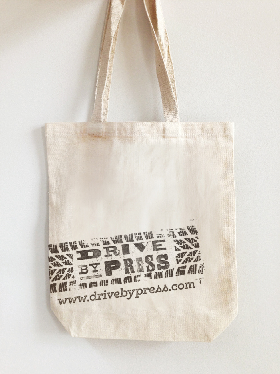
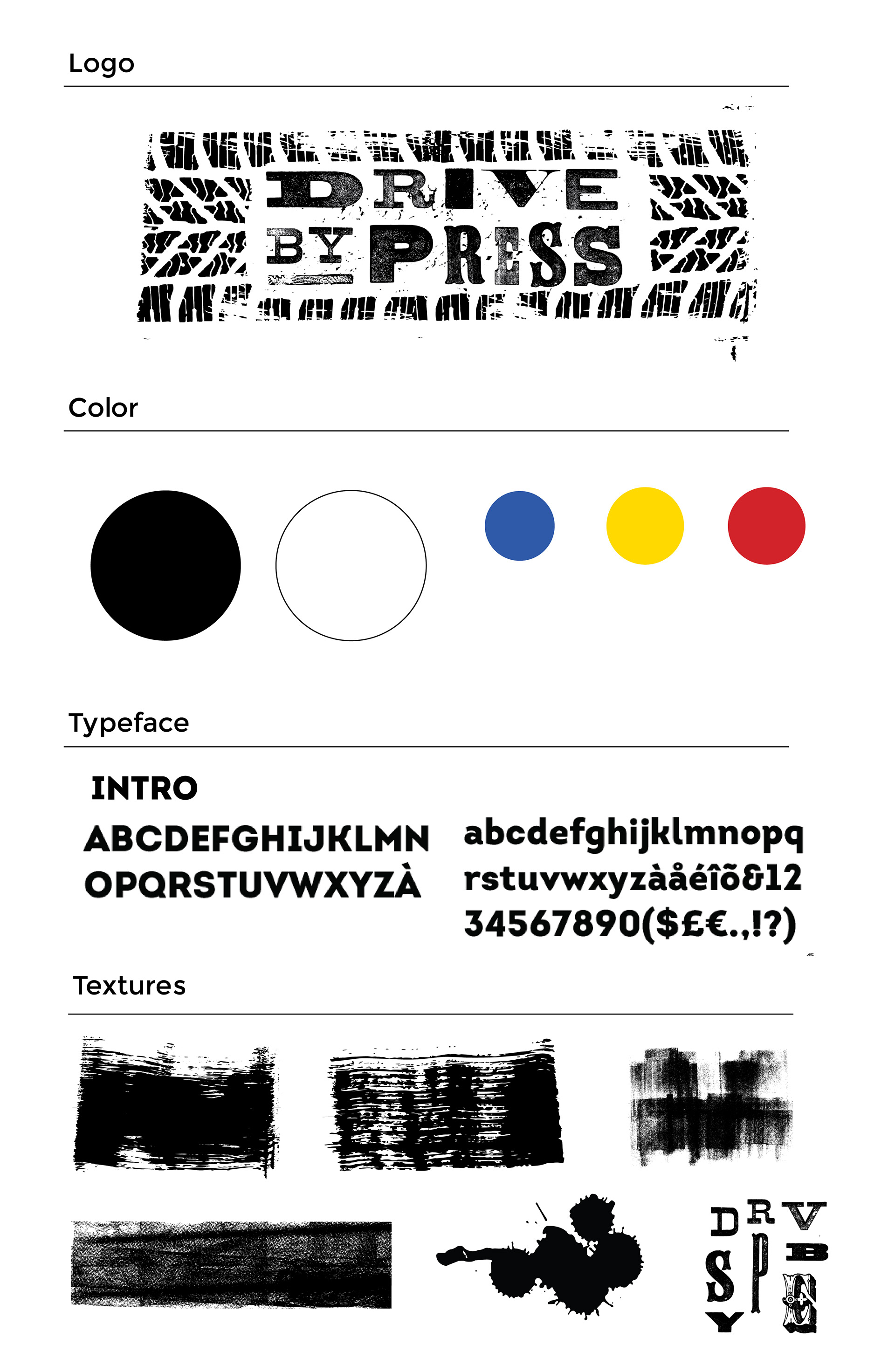
Movement is a big aspect in the creation of the logo. Using the pattern of a tire
tread in combination with woodtype helped express not only the traveling approach,
but also the process. Rather than having a set color palette, black is the main
color for versatility, with blue, red, and yellow as the secondary colors.
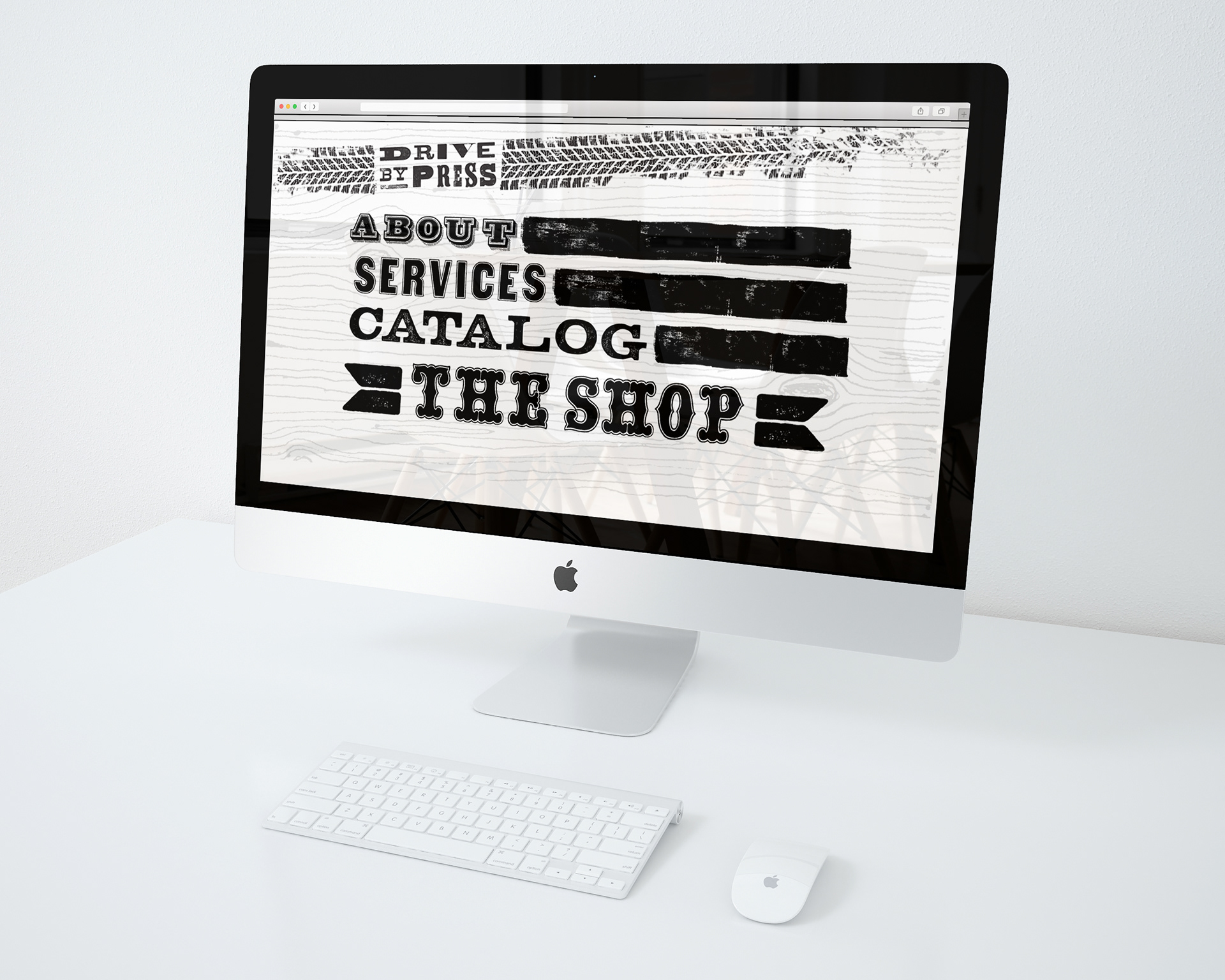
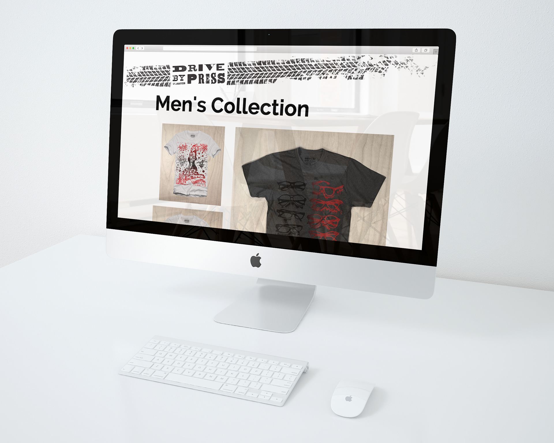
The project aims to gain awareness of a service that is provided
to universities, festivals, art fairs, etc.